
The first step was to meet with the owners of Zas Air Group to create a brief in which we could understand the brand’s features and goals for the next 12 months.
Brief Conclusion
Established in 1976, Z-Aviation Services (ZAS) recognized the need to represent and protect foreign carriers’ interests during their operations worldwide, and that is what they’ve been doing ever since. They had fulfilled a gap in their global industry, and approached us when they were ready to expand.
The second step was brand development.
This involved identifying the business's ideal image with our marketing and design services to attract the perfect target client, resulting in a well-known brand identity.
Brand Guidelines
1- Logo Options and Process
We designed the logos and visual identities for each Zas branch according to their industry and the attributes that identify and set them apart from the competition.
Font
Exodus
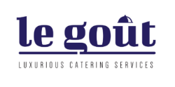
Representing class and freedom, Exodus is a display serif typeface with luxurious lines and unique ensemble of characters.
Colors
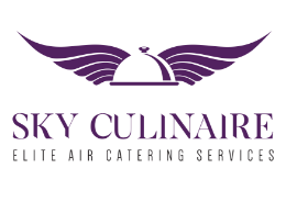
- Grape : Means royalty, quality & richness.
- Ziggurat : Accent color.
- Eden : Means friendliness, wealth and freshness.
Concept
Combining a cloche lid with wings, we represented the brands catering services and flight.

Font
League Spartan
The font choice gives the brand a welcoming world class look.
Colors
- Venice Blue: Represents friendliness, dependability & Trust.
- Mid Gray: Accent color.
- Tropical Blue: Sky color
- Alizarin Crimson: Represents confidence, desire,
Concept
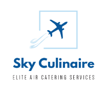
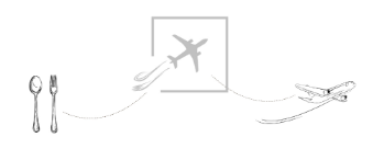
Here we combined a plane image with a fork and spoon symbolizing their in-flight catering services.
Font
Futura Md BT
The font choice provides a friendly, professional, and appealing look.
Colors
- Bunker: Represents richness, power and elegance.
- Iron: Accent color.
- Sorrell Brown: Accent Color.
- Dallas: Represents reliability, honesty and warmth.
Concept
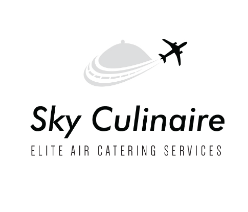
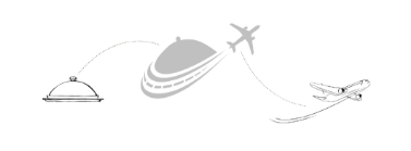
Combining a plane shape with a cloche, we portrayed their in-flight catering services.
Font
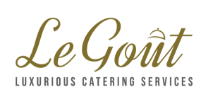
Dynalight
The font choice represents class, and elegance. Its dynamic high-speed script loaded with curves and soft angles makes for an eye-catching typeface.
Colors
- Crete: Means royalty, quality & richness.
- Pantone Black: Slogan color
Concept
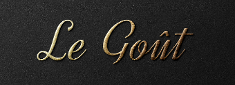
This design is based on smooth script that gives an elegant, French, classy look.
Font
Abril Fatface
This font choice displays both neutrality and a strong presence that demands attention.
Colors
- Cardinal: Represents friendliness, dependability & Trust.
- Madras: Accent color.
- Blue Chill: Sky color.
- Yellow Metal: Represents confidence, desire, power, pride and love.
Concept
We combined the brand name with a familiar restaurant aesthetic that plays into the French name.
Font
Bigshot one
The font choice is a contemporary Didone. The design fits its product features and is best displayed naturally without distractions.
Colors
- Valhalla: Represents energy, richness and elegance.
- Ivory Black: Accent color.
- Maroon: Represents intensity, passion and ambition.
- Violet: Represents imagination, calmness and wisdom.
Concept
We transformed the accent into a cloche lid representing catering services.


