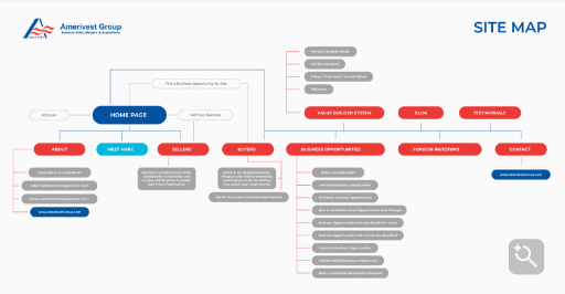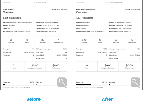

The first step was creating a brief, which helped us understand the principles of Biz by Marc and the company's goals.
Brief Conclusion
Marc Horowitz is a Financial Executive with an extensive corporate finance and accounting background. A certified public accountant since 1991, he is a seasoned Chief Financial Officer familiar with delivering value and driving results.
His experience ranges from small business to Fortune 500. He is also skilled in private equity, growth and turnaround strategies, process improvement, mergers & acquisitions, financial modeling, and business.
The second step was branding.
Through consulting with our client and providing various options, we developed a brand image and identity to attract Biz By Marc’s ideal client.
Brand guidelines
1- Logo Options and Process
The visual identity (logo, fonts, and colors) was developed considering the essential attributes of Biz by Marc, like trust, professionalism, and energy.
Font
Bebas Neue Regular
The font choice represents clarify and professionalism, which is very vital for the brand’s image.
Colors
- EC3F3B
- 2160A0
Concept
The logo represents the letter M, which represents the first letter of Marc's name, which merges with the shape of the link as a metaphor for the nature of the broker's work in linking the seller and the buyer, thus merging in an abstract way.

Brand guidelines
1- Logo Options and Process
The visual identity (logo, fonts, and colors) was developed considering the essential attributes of Biz by Marc, like trust, professionalism, and energy.
Font
Tostada Regular
Colors
- EC3F3B
- 2160A0
Concept
The logo represents the business name in an eye-catching way.
Brand guidelines
1- Logo Options and Process
The visual identity (logo, fonts, and colors) was developed considering the essential attributes of Biz by Marc, like trust, professionalism, and his business atmosphere.

Font
Mplus 1p
The font choice represents clarify and professionalism, which is very vital for the brand’s image.
Colors
- EC3F3B
- 2160A0
Concept
The logo represents a letter combining the shape of the real estate or business by merging the letter M, which represents the first letter of the name of Marc to merge in an abstract way.

Brand guidelines
1- Logo Options and Process
The visual identity (logo, fonts, and colors) was developed considering the essential attributes of Biz by Marc, like trust, professionalism, and energy.
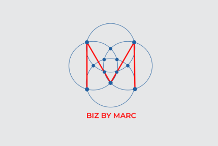
Font
Montserrat SemiBold
The font choice represents clarity and professionalism, which is vital for the brand’s image.
Colors
- EC3F3B
- 2160A0
Concept
The logo represents the letter M, the first letter of Marc's name, which we merged with the shape of a link as a metaphor for the nature of a broker's work linking the seller and the buyer.

Social Media presence
3- Social Media Posts
The social media content strategy that we developed for Biz by Marc was based on sharing educational, promotional, and branded content associated with business selling, mergers, and acquisitions. All of this with the primary goal of generating leads for Marc’s services.

The Third Step
We then began client acquisition by running a custom marketing campaign to maintain positive reputation management and create qualified lead generation.
1- Marketing Campaigns and Analytics
Social media ads
We designed graphic pieces representing the brand’s guidelines and used them to create social media ads with intriguing captions and ideal calls to action according to our client’s goals.

Reports
As with all our clients, we provided performance reports detailing the metrics of our social media ads and our observations and recommendations for the following month.
